Mastering the Art of Home Design: Neutrals vs. Vibrant Colors
Discover the Perfect Balance for Your Space! - What Are Neutrals?
Neutrals are the background colors that lay the foundation for other colors in a space. Examples of neutral colors include beige, taupe, gray, cream, brown, black, and white.
Tip: Neutrals can be more complex than people give them credit for. The way light hits neutrals can majorly affect the way everything plays out for the rest of the room. For example, if you paint your walls a cream with warmer undertones, in some lighting, the warm tones may look more orange than you expect. So, remember to take your lighting into consideration.
Wood Neutral Tones
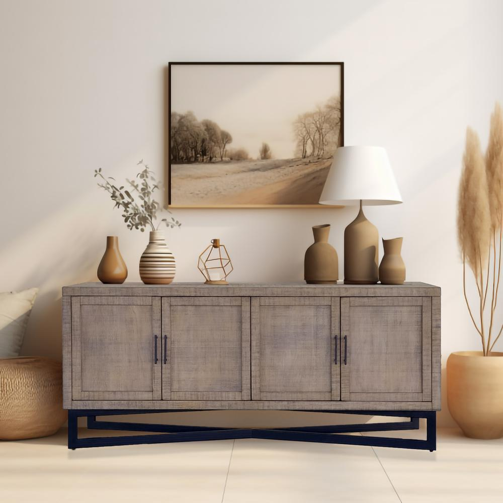
Take this wooden sideboard: it is solid wood with a walnut finish. It has warm tan undertones.

Try matching with another neutral with warm undertones:
The Barbara Sideboard is brown with ashy gray undertones.

Try mixing those gray undertones with darker gray hues such as:
- Charcoal Gray Accents: Adding charcoal gray cushions or a throw blanket can enhance the gray undertones of the sideboard, creating a cohesive look.
- Slate Gray Rugs: A slate gray rug can anchor the space, complementing the ashy tones of the sideboard and adding depth to the room.
- Pewter Accessories: Incorporate pewter vases or picture frames to tie in the darker gray hues, adding a touch of sophistication.
Adding More Color
If you're looking to add more color to your space, consider these ideas:
1. Accent Walls:
- Choose a bold color for one wall to create a focal point. For example, a rich navy or deep forest green can add drama and interest without overwhelming the room.
2. Colorful Furniture:
- Introduce a statement piece of furniture in a vibrant color. A teal sofa or a mustard yellow armchair can bring life to a neutral room.

3. Art and Accessories:
- Use colorful artwork, cushions, and decorative accessories to add pops of color. This is an easy way to change the look of a room without committing to a permanent change.
4. Layering Colors:
- Layering different shades of the same color can add depth and dimension. For instance, various shades of blue can create a serene and cohesive look.
5. Natural Elements:
- Incorporate plants and flowers to add a natural splash of color. Greenery not only enhances the aesthetic but also brings a sense of freshness to the space.
Balancing Neutrals and Colors
To achieve a balanced look, consider these tips:
1. Use the 60-30-10 Rule:
- 60% of the room should be a dominant color (often a neutral), 30% should be a secondary color, and 10% should be an accent color. This creates a harmonious and visually appealing space.
2. Mix Textures:
- Combining different textures can add interest to a neutral palette. For example, mix soft fabrics like velvet with rougher textures like jute or wood.

3. Mind the Undertones:
- Pay attention to the undertones of both your neutrals and your colors to ensure they complement each other. Warm undertones should be paired with warm colors, and cool undertones with cool colors.
Practical Applications of Neutrals and Colors
Neutrals in the Living Room
A living room with a neutral palette can be very inviting. Start with a base of cream or light gray for the walls. Add in furniture pieces in varying shades of beige and brown. To avoid a monotone look, incorporate different textures such as a plush sofa, a wooden coffee table, and metal light fixtures.
For added interest, use colorful throw pillows, a patterned rug, and some artwork. If your furniture is neutral, you can afford to go bolder with your accessories. Think vibrant blues, greens, or even reds to liven up the space.
Neutrals in the Bedroom
In the bedroom, neutrals can create a calming and restful atmosphere. Soft grays, whites, and taupes are perfect for this space. Use white bedding with gray accent pillows and a taupe headboard.
Introduce subtle color through bed throws, lamps, and bedside tables. Light pastel shades can work well here, such as blush pinks, light blues, or soft greens. These colors add a touch of warmth and personality without overwhelming the tranquil vibe of the bedroom.
Combining Neutrals and Colors in the Kitchen
A kitchen can benefit from a mix of neutrals and colors. White or gray cabinets provide a clean and classic look. Pair them with a colorful backsplash or countertop. For example, a bright turquoise backsplash can bring a refreshing burst of color to an otherwise neutral kitchen.
Accessories like colorful dishware, rugs, and bar stools can also inject personality into the space. If you prefer a more subtle approach, opt for neutral countertops and backsplash, and add color through small appliances and kitchen textiles.
Lastly
Whether you decide to incorporate neutrals or add more color, the key is to create a space that feels balanced and reflects your personal style. By understanding the complexities of neutrals and the impact of color, you can design a room that is both functional and beautiful. Remember, there's no right or wrong approach—it's all about what makes you feel at home.

Don't forget to take a look at our latest Community Spotlight Article
Happy decorating!
- Team Quin Interior